
Choosing the right colors is one of the most important parts of designing a custom football uniform. Team colors do more than make players look organized. They communicate identity, create a strong visual presence, and help supporters recognize the team immediately. A well-planned color combination can make a uniform look professional, modern, and memorable while also supporting player visibility on the field.
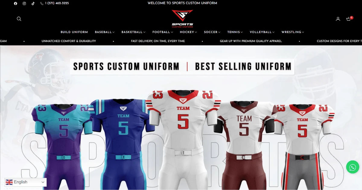
Football is a sport built around teamwork, energy, and competition. The uniform should reflect those qualities. Whether a team uses traditional colors such as navy and white or a bold combination such as red and gold, every color should have a purpose. The goal is not simply to place several favorite colors on a jersey. Instead, the colors should work together across the jersey, pants, socks, numbers, helmets, and other equipment.
Why Team Colors Matter in Football Uniforms
Team colors are closely connected to a club's identity. When players enter the field wearing consistent colors, spectators can quickly identify them. Over time, those colors can become strongly associated with the team's history, achievements, and community.
A strong custom football uniform should therefore use team colors consistently. This does not mean every part of the uniform must contain exactly the same amount of each color. It means the overall design should have a recognizable color system.
For example, a team with blue and white as its official colors might use blue as the primary jersey color, white for numbers and trim, and a smaller amount of a secondary accent color. This creates balance without making the uniform visually confusing.
Start With Primary and Secondary Colors
The first step is deciding which colors should dominate the uniform. Most teams benefit from having one primary color and one or two supporting colors.
The primary color should be the most noticeable shade. It can cover most of the jersey or pants and establish the team's visual identity.
The secondary color can be used for numbers, stripes, sleeves, collars, side panels, and other details. If a third color is needed, it should usually function as an accent rather than competing with the primary shade.
Use the 60-30-10 Approach
A useful design principle is the 60-30-10 rule. Although it is not a strict football requirement, it can help create a balanced appearance.
Approximately 60 percent of the design can feature the dominant team color. Around 30 percent can use the secondary color, while about 10 percent can be reserved for accents.
For example, a black-and-gold team might use black as the dominant shade, gold for numbers and major trim, and white for small details. This approach prevents all colors from competing equally for attention.
Make Player Numbers Easy to Read
Visibility should always be a major priority. A beautiful uniform can still be ineffective if players' numbers are difficult to recognize from a distance.
When selecting colors, consider the contrast between the jersey and the numbers. Dark jerseys generally need light numbers, while lighter jerseys often work better with dark numbers.
A custom football uniform should also consider number outlines. If the primary jersey and number colors are too similar, an outline can separate the two. For instance, white numbers with a thin dark outline can remain visible on several backgrounds.
Consider Contrast From Different Distances
A uniform needs to work from more than a few feet away. Spectators may be sitting high in the stands, while coaches and officials may view players from different angles.
Designers should examine the colors at both close and long distances. Small decorative details may disappear from far away, but major elements such as jersey numbers and team colors should remain clear.
Think About Home and Away Uniforms
Many football teams need different uniform combinations for home and away games. Team colors should remain recognizable in both versions.
A common approach is to use a dark primary jersey for one uniform and a light jersey for the other. The colors can change in proportion while maintaining the same team identity.
For example, a team whose colors are green, white, and gold could use a green jersey with white numbers at home and a white jersey with green numbers for away games. Gold could appear as a consistent accent in both designs.
The important point is that both versions should look like they belong to the same organization.
Match the Jersey With the Pants
Team colors should not be considered only when designing the jersey. The pants are equally important to the overall appearance.
A jersey with several colors can become overwhelming if the pants introduce additional competing shades. In many cases, using one of the existing team colors for the pants creates a cleaner appearance.
For example, if the jersey is predominantly red with white and black details, black or red pants may work better than introducing a completely new color.
A coordinated custom football uniform should make the jersey and pants look like parts of one complete design rather than separate garments.
Use Accent Colors Carefully
Accent colors can add personality and help a uniform stand out. However, too many accents can weaken the visual identity.
A bright color such as neon green, orange, or metallic gold can be effective when used in moderation. It might appear around the numbers, along a stripe, or within a logo.
The accent should support the main colors instead of taking control of the entire design.
Avoid Too Many Competing Colors
Using four, five, or more strong colors can make a football uniform look busy. Even if each shade looks attractive individually, the combination may lack a clear visual hierarchy.
A simple palette is often easier to recognize and reproduce across different products. It also makes it easier to coordinate jerseys, pants, socks, jackets, bags, banners, and other team merchandise.
Consider the Team Logo
The team logo should influence the color decisions. Ideally, the logo should remain visible without clashing with the rest of the uniform.
If the logo contains several colors, designers can choose one or two of those shades as the primary uniform colors. This creates a stronger connection between the logo and clothing.
For example, a logo containing navy, silver, and white can inspire a uniform built around navy and white with silver accents.
The logo should not disappear into the jersey background. If necessary, an outline or contrasting border can improve its visibility.
Think About the Helmet
The helmet is one of the most noticeable pieces of football equipment. Its color should complement the uniform rather than appear unrelated.
A helmet can match the dominant jersey color for a traditional appearance. Alternatively, a contrasting helmet can create a distinctive modern style.
Helmet decals should also use the team's established colors. Consistency between the helmet logo, jersey logo, and other branding makes the entire team appear more professional.
Coordinate the Socks and Accessories
Small details can have a surprisingly large effect. Socks, gloves, wristbands, sleeves, and other accessories should fit the team's color scheme whenever possible.
Not every accessory needs to match perfectly. However, allowing too many unrelated colors can reduce the visual consistency of the team.
A simple combination of team-colored socks and neutral accessories can keep the overall appearance organized.
Consider Lighting and Weather
Football games can take place under bright sunlight, stadium lights, cloudy skies, or even poor weather conditions. Colors can look different depending on the environment.
Very dark colors may absorb light and appear less detailed at night. Very bright colors can look more intense under stadium lighting.
A custom football uniform should be evaluated under realistic playing conditions when possible. The colors should remain attractive and recognizable without making important details difficult to see.
Account for Fabric and Printing
The final color can sometimes differ from what appears on a computer screen. Fabric type, printing method, embroidery, and material finish can affect how a color looks.
Before placing a large order, teams should review available color samples or production proofs. This is particularly important for unusual shades or colors that need to match an existing logo.
Consistency matters if a team already has branded equipment. A slightly different shade of blue or red may be noticeable when jerseys are placed beside older uniforms.
Think About Color Fastness
Football uniforms are washed frequently. Colors should remain stable after repeated washing and use.
Teams should ask manufacturers about the quality of dyes, printing, and fabric. A color scheme that looks excellent on the first day will not be successful if it fades quickly.
Durability is especially important for teams that play an entire season and continue using their uniforms for tournaments or future competitions.
Use Color Psychology Without Overthinking It
Colors can influence how people perceive a team. Red is often associated with energy and intensity, while blue can communicate confidence and stability. Black can create a powerful appearance, and green may suggest strength, freshness, or connection to tradition.
These associations can help guide design decisions, but they should not replace the team's existing identity.
If supporters already recognize a particular color combination, changing it dramatically may create unnecessary confusion. A successful design balances tradition with modern presentation.
Make the Uniform Recognizable From the Stands
A good football uniform should have a strong silhouette and recognizable color arrangement. Supporters should be able to identify the team even when individual logos and small details cannot be seen clearly.
Large blocks of color, strong contrast, and consistent placement can help achieve this.
For instance, a distinctive stripe running along the shoulders or pants can become part of a team's recognizable visual identity.
The objective is to create a design that remains identifiable without relying entirely on small printed graphics.
Balance Tradition and Modern Style
Some teams have long histories associated with particular colors. In these situations, preserving familiar colors can strengthen the connection between current players and previous generations.
Modern design elements can still be introduced through updated typography, subtle gradients, geometric patterns, or different color proportions.
A custom football uniform does not have to abandon tradition to look modern. Small changes can refresh the appearance while keeping the team's identity intact.
Keep Historical Colors Relevant
If a team has an established color scheme, consider making those colors the foundation of the new design. A modern uniform can then introduce updated details without losing the connection to the team's history.
This is particularly valuable for school teams, community clubs, and organizations with strong local traditions.
Test the Design Before Ordering
Before approving a final uniform, review the design from several perspectives. Look at the jersey, pants, helmet, socks, and accessories together.
Check whether the numbers are readable. Make sure the logo stands out. Confirm that the colors remain recognizable from a distance.
It can also help to show the design to players, coaches, and team supporters. Different people may notice practical or visual issues that a designer overlooks.
A digital mockup is useful, but physical samples provide an even better understanding of how colors and materials will appear.
Common Color Mistakes to Avoid
One common mistake is choosing colors simply because they look attractive individually. A uniform needs colors that work together.
Another mistake is using poor contrast for numbers. This can create identification problems during games.
Some teams also use too many decorative colors. This can make the uniform look inconsistent and make future branding more difficult.
Finally, teams sometimes forget about the entire kit. A jersey may look excellent by itself but become less appealing when combined with poorly matched pants, socks, or helmets.
Practical Color Design Checklist
Before finalizing the uniform, consider these questions:
-
Is there one clear primary team color?
-
Do secondary colors support rather than compete with it?
-
Are jersey numbers easy to read?
-
Does the logo have enough contrast?
-
Do the jersey and pants work together?
-
Can the colors be recognized from a distance?
-
Does the helmet complement the uniform?
-
Do socks and accessories fit the color system?
-
Will the colors work under different lighting conditions?
-
Are the selected materials durable and colorfast?
-
Does the design respect the team's existing identity?
Answering these questions can prevent expensive design changes later.
How Team Colors Build a Stronger Identity
A team's colors can become much more than a design choice. They can represent a school, city, club, community, or group of supporters.
When players consistently wear the same colors, those shades become associated with memorable games and important moments. Fans may wear the same colors in the stands, while merchandise extends the identity beyond the football field.
This is why color consistency should be considered a long-term branding decision rather than a temporary fashion choice.
A thoughtfully designed custom football uniform can strengthen that identity every time the team takes the field.
Conclusion
Team colors should be the foundation of football uniform design. The best approach is to choose a dominant color, support it with one or two complementary shades, and use accent colors carefully. Contrast should remain a priority so that numbers, names, logos, and other important details are easy to see.
The design should also consider the complete kit, including jerseys, pants, helmets, socks, and accessories. Lighting, fabric, printing methods, durability, and the team's existing branding all deserve attention before the final order is placed.
Most importantly, the uniform should represent the team. Whether the style is traditional, modern, bold, or simple, the colors should communicate a clear identity that players can feel proud to wear.
A successful custom football uniform is not simply colorful clothing. It is a visual representation of teamwork, tradition, confidence, and belonging. By carefully planning color proportions, contrast, coordination, and consistency, teams can create uniforms that look professional on the field and remain memorable to players and supporters for years to come.